Brand Guidelines
The information below is provided to help you use and properly reference our brand features, Assemble logos, and trademarks. Please download our resources for the following.
Download Resources
Assemble focuses on bringing people and process together with one powerful solution. Our aim is to assist with every aspect of the volunteer journey and we wanted to do it with software that was nice to look at and easy to use.
Logo
The Assemble logo is the most immediate representation of our company, our culture, and our brand. We want it to be instantly recognisable, so consistency is important – please don’t edit, change, distort, recolour or reconfigure it. We put a lot of thought and love into its design and we thank you in advance for respecting its usage.
Assemble logo variations
The Assemble logo is available in four colours. The Assemble logo should always appear as either full colour, greyscale, Assemble grey or white out. The core (colour logo) on white background is the preferred version so please use this as much as possible. We use this across all Assemble communication material – from internal and external comms to our website and stationary.
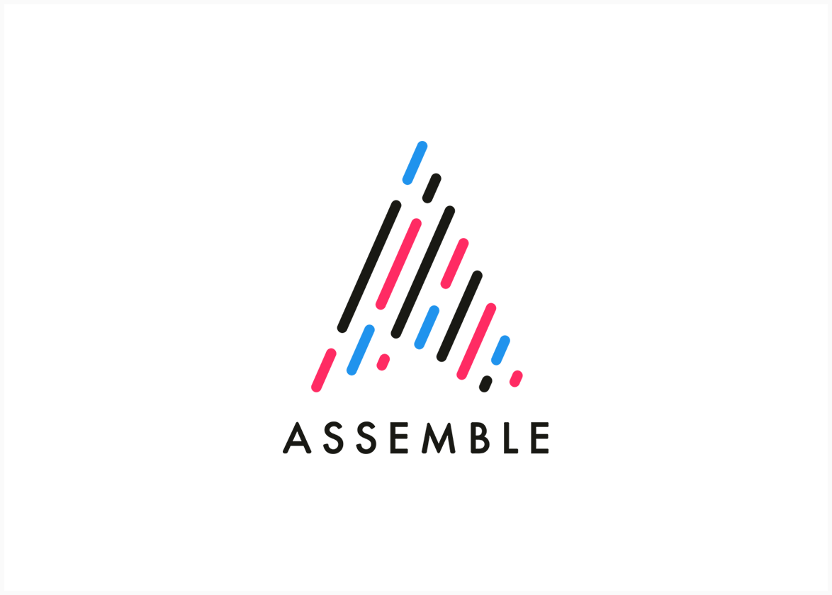
Colour (Core)
This is our primary logo.
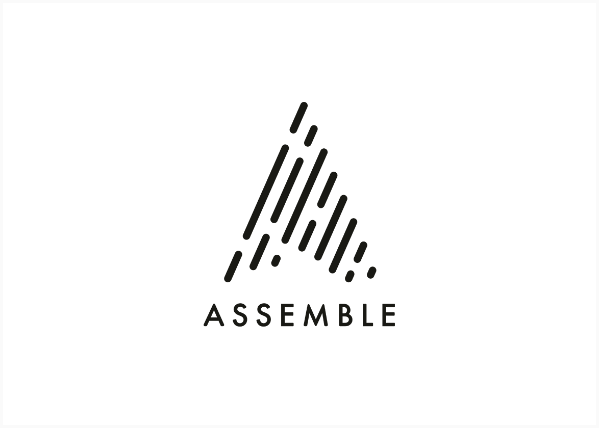
Assemble Grey
Printing one colour? Use our Assemble Grey logo.
Greyscale
Greyscale to be used on light backgrounds.
White
On darker backgrounds, use our white logo.
Logo use
The logo should not be misinterpreted, modified, or added to. No attempt should be made to alter the logo in any way. Do not rotate, warp, or disproportionately scale the logo. Its orientation, colour and composition should remain as indicated - there are no exceptions.
The relationships between the ‘Assemble name’ and ‘Assemble mark’ are fixed and are not to be altered. The word Assemble is never used on its own – it always includes the Assemble house ‘A’ mark.
Space/size
In order to give our logo maximum legibility and exposure, please allow for an area of clearance around the entire logo. This gives the logo prominence and ensures that it will not be obscured or diminished by other surrounding elements.
Three fundamental colours make up our core palette. It represents style and exudes confidence.
These are the 'default' colours for use within the Assemble palette and all visual communications. This core palette presents a consistent and recognisable image across all business activity. They enhance the user experience, from the way customers engage with our product to the connections we forge through our content.
Colour Palette
Assemble Grey
C:70.76, M:64.49, Y:69.34, K:79.78
R:25 G:25, B:20
#191914
Assemble Magenta
C:0, M:93.36, Y:43.43, K:0
R:255, G:43, B:99
#ff2b63
Assemble Cyan
C: 71.9, M:35.33, Y:0, K:0
R:32, G:147 B:237
#2093ed
Off white, greys and the use of space, plays an important role in our communication material.
Assemble Warm White
C:0, M:0, Y:0, K:2
R:250 G:250, B:250
#fafafa
OUR WHITE
We have added off-white and two grey tones to the core colour palette to add depth and sophistication.
Note: The off-white is only used when a plain white background is just too stark.
Assemble Grey
C:70.76, M:64.49, Y:69.34, K:79.78
R:25 G:25, B:20
#191914
Grey 2
C:59.77, M:51.18, Y:50.77, K:20.13
R:102, G:102, B:102
#666666
Grey 3
C: 31.5, M:25.13, Y:25.57, K:0
R:177, G:177 B:177
#b1b1b1
GREYS
The use of greys for typography font colours are preferred
to using solid black.
Primary font colour is: Grey 2
Our confidence primary colour system is enhanced with a bright and balanced secondary palette.
Our Colours
It is important to have a complementary colour palette to extend and add life to our core colour palette. We have developed a set of secondary colours.
These colours should be used rarely and sparingly. Under no circumstances should any of them become the predominant colour.
Online actions include:
Secondary / Primary link
Assemble Cyan
R:32 G:147, B:237
#2093ed
Secondary / Muted link
Grey 3
R:177, G:177, B:177
#666666
Tertiary / Yellow
R:255, G:211 B:60
#ffd33c
Secondary / Success link
R:0 G:174, B:146
#00ae92
Secondary / Warning link
R:255, G:121, B:95
#ed704c
Secondary / Info Link
R:133, G:107, B:200
#846ac8
Secondary / Danger link
R:180 G:17, B:36
#ff5c66
Typography
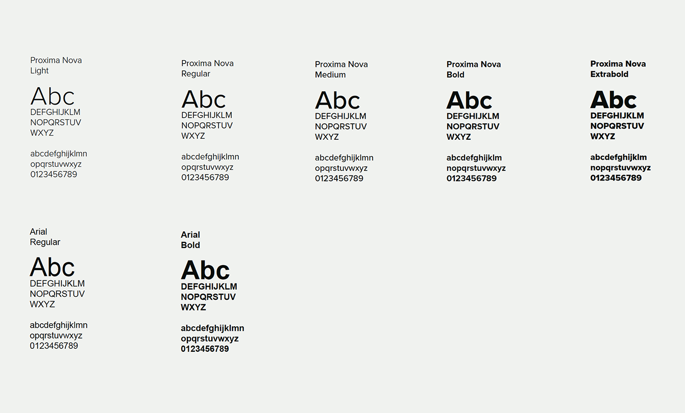
Typography plays a key role in our brand. Our typeface defines a language which is intrinsically Assemble.
Proxima
Nova Alt
& Arial
PROXIMA NOVA is a well balanced, modern and rounded complete typeface designed to represent the properties and values of our brand. It is an essential part of our visual language and is the only typeface used within brand related headline or statements.
Our main body copy font is Proxima Nova Regular
Arial
Arial is a standard system font and we use it for all word, PPT and Excel documentation and anywhere brand graphic brand message is not required.
